

other posters (antibullying mostly):

not immediately obvious what it's about until you look closer, which draws the viewer in. it is effective, considering the message. eye contact with the girl makes the viewer sympathise & have an emotional response


these posters use subversion and juxtaposition of slurs and noose/self harm, implies suicide. very simple and to the point, and shocks. pathos/emotional reaction

simple use of rainbow coloured words makes it obvious its about lgbt hate crimes, juxtaposition of rainbow colours and negative words.


three posters about not using the word gay to mean negative: the first one uses ethos (I'm assuming that's a well known sports person), as an authority so that fans are influenced. the second is more logos; pointing out that there are many other words that aren't slurs to use. also questions the viewer and puts them on the spot. maybe makes them feel bad about using gay as a slur. the third is also probably logos, using juxtaposition of two images and the literal meanings. it isn't particularly interesting visually, though perhaps that's the point: to just compare the words/pictures literally.

homage (parody?) of the uncle sam posters, is recognisable and draws in the viewer, rainbow flag in the background makes it lgbt related. could probably have been done in a more integrated way rather than just literally using the same uncle sam image.

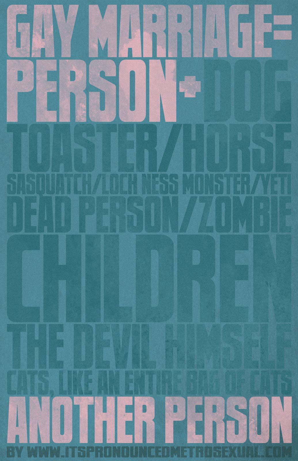
this poster emphasises the fact that same gay marriage is just marriage between two people not 'it'll lead to people marrying their dog!!!' like some homophobic people say. it uses satire - exaggerating things (the devil himself; cats, like an entire bag of cats) to show the absurdity of that concept.
protest signs (mostly just words): x x
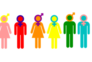
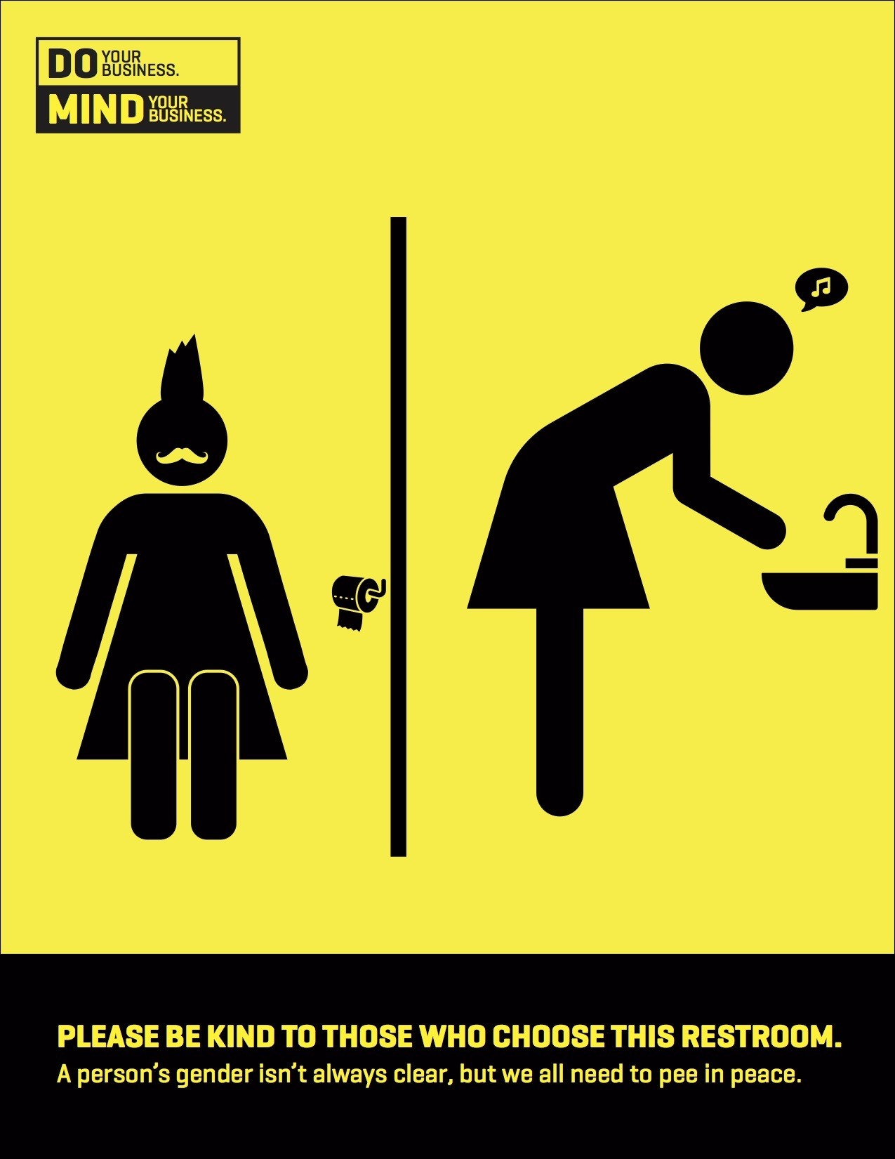
some posters/symbols against gender binary and other various things:


No comments:
Post a Comment