Sunday 21 August 2016

type

headline is too small, a bit lost here.

not centered? it looks good but not in relation to the rest of the poster, which is centered.

lowered the type a bit, and made it bold oblique. this stands out a lot more and has more emphasis.
(but was a bit too low, I pulled it up a bit)


-headline's too long

more direct?

-I think I like this better (with 'it's hard') because it appeals more to the emotions? eg is talking about how it affects someone.

-too short probably


-

Saturday 13 August 2016

text

tried to find a font like "the birds" font, to try it out, I don't think it works very well though.

a simpler one. I think this works pretty well, but I'll print it out and see.


the placement in this corner works quite well, because it adds to the dynamism of the diagonal.


all of it up the top? I'm not sure exactly what I want the tagline to be, which makes it hard. I need outside advice.

this makes your eyes go straight down and across instead of diagonally - it divides the dynamic line which makes it not work as well.

this works well too, and almost lines up with the bottom of the image. I don't think it's dynamic enough though?


I actually am really liking this one with text? the negative space is nice. Though I'm not sure if the placement of the text works - the asymmetry is nice but I think the hierarchy is off.


aligning with the eye?
a more elaborated headline? maybe too much text squashed in the corner there. it's nice that it's all (the black bird too) coming from the right hand side, with lots of space on the left.


an inverted version, a different headline? not sure.

developments

another newish idea: the big bird made of lots of smaller ones. Also using the splatter/messy effects & scale to make the black one seem evil.
added words - not sure if the one with dark words or light ones inside it works better? the first is like it's expelling them, the second like it's made up of them..


cropped in closer and experimented with lots of different coloured backgrounds - red works best at showing evilness, but because the small bird is rainbow that means part of it gets lost, no matter what colour is used.

and adding a bit of white just creates a bar like it's being protected, which is not the point of the poster


I think overall I like the black and white best- because they are the "straight flag" colours and also the small bird being the only colour means it's a focal point, and adds to the meaning of it being good and unique. Also cropped it in a bit so it's more trapping.


inverted?


-------------------------------------


Made the words inverted - which means I can make the black darker and create more contrast and dynamism

A slightly lighter version because it usually comes out darker from the printer.


A slightly cropped version of this one- centering it instead?

Or using photographic images of birds? I like the way it fades to darkness, leaving a nice space for the headline.. I feel like I need to find a better rifleman photo, because this one doesn't quite suit - it looks bored and isn't looking up at the birds?

The outline of negative space around the bottom looks awkward here.

Thursday 11 August 2016

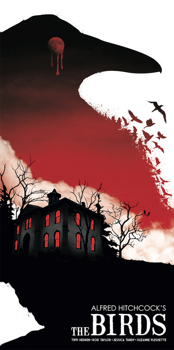
lots of design examples of bird silhouettes/swarms for inspiration

I like the use of negative space here.

- this one uses text  like a bird swarm, 


-I like how these ones use the block silhouettes of birds which morphs into a black shape


-I like the scratchy/paint effect of this one, which I have tried to replicate with ink in one of my versions. Also, the giant bird made of smaller birds thing is something I could play with? as in, little things add up


styles

I used some photographs of magpies to recreate one of my concepts

I like this idea- but I don't think it's as strong as my other compositions. Maybe I'll reuse some of this by cropping it and flipping it? I like the way the birds fade into a black mass.


made them into blocky shapes - i like the harsh pointiness, it adds to the negative/mean/antagonistic feel of them, as well as the contrast of black and white. I wonder if I could do anything with the negative space?


added more birds in the back to make it more like a swarm. Not sure if it's a little less dynamic without such a contrast of negative space?


Remade this concept traditionally with ink - to see if the harsh scratchy brushmarks add to the tone. I still need to add the words to this, I will try to make this in a few more styles before I settle on one if I have time.